
Visualization
History and Definition
Visualization has a long history. In fact, “visualization techniques . . . have been used for centuries” (Bailey). Dating as far back as the medieval period, manuscripts contained tree diagrams to classify as a mnemonic technique, as shown in figure 1 (Bailey).
Figure 1: 
from Peter of Spain’s 13th century ‘Dialectica’
William Playfield was a pioneer in the field of Information Visualization for statistical graphics as he created the line graph, bar chart, and pie chart (Bailey). Though it should also be mentioned that John Snow and Florence Nightingale also contributed to the field, in terms of public health (Bailey). Charles Joseph Minard took visualization a step further and employed Geovisualization to demonstrate Napoleon’s army’s movement during “the campaign of 1812” (Bailey). However, the study of Geovisualization (which I will discuss in more detail below) became central to Visualization due to Jacques Bertin’s cartographic work.
The development of Information Visualization and Geovisualization have a long history, and we could even include Scientific Visualization in this history if we were to consider Leonardo Da Vinci’s work Anatomist (Figure 2). However, it was not until the 1980s that Visualization as we know it now came to be, and this is due to the emergence of computer graphic programs (Bailey). For the purpose of this course, what we are concerned with is Digital Visualization. So what is Digital Visualization (or as I will refer to it below as simply Visualization)?
Figure 2: 
Visualization comes from the root word visual, which is Latin for “to see” or “sight”. Knowing the etymology of a word is useful, but in this context, Visualization, especially in the digital sphere is much more specific. The Oxford English Dictionary (OED) provides two definitions for Visualization. The first, which was used from 1883 to 1894, is “[t]he action or fact of visualizing; the power or process of forming a mental picture or vision of something not actually present to the sight; a picture thus formed” (OED). The second, used from 1926-1982, is “[t]he action or process of rendering visible” (OED). These definitions are still quite vague, therefore, I would like to provide my own amalgamate definition, based on class discussion “the representation of data in visual form to display information”. While this definition is still vague, it encompasses the multiple dimensions of visualization in the Digital Humanities.
Types
According to Lev Manovich, there are three types of Visualization:
• Information Visualization: “mapping between discrete data and a visual representation” with the use of numerical and non-spatial data (Manovich); Information Visualization can be associated with linear graphs, pie charts, etc. and is usually two dimensional (Manovich), (my own research)
Figure 3 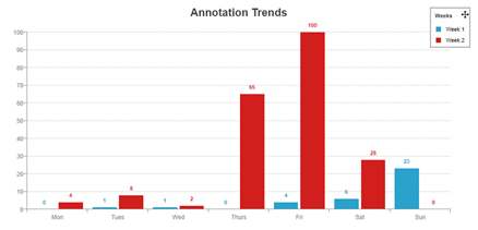
• Scientific Visualization: most often than not uses non-numeric data and spatial data to create 3D representations of a phenomenon; Scientific Visualization is used in medicine, astronomy, archeology, computer science, etc., and (my own image)
Figure 4 
• Geovisualization or Geographical Visualization: while similar to Scientific Visualization as it also uses spatial and mostly non-numeric data, it actually deals mostly with mapping and urban simulation; the field grew out of Jacques Bertin’s work in cartography.
Figure5 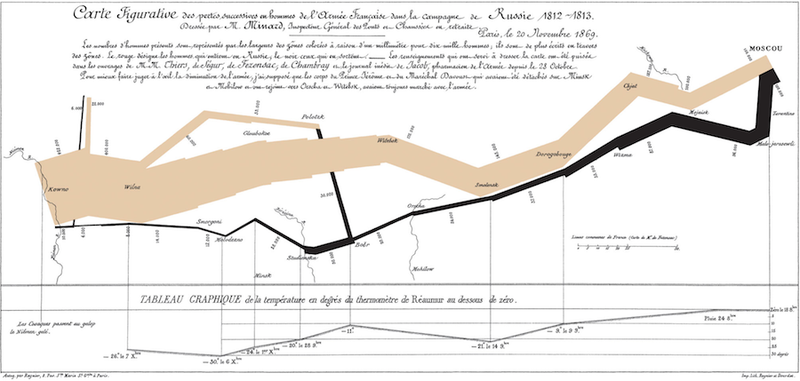
(Bailey)
There is also a variety of types of data used in visualization, which are dependent on the type of visualization you are conducting. Different types of data may also be used in conjunction with one another. The data types include:
• Spatial: “position, size, shape, and more recently curvature of lines and movement”,
• Non-spatial: “numbers, characters or logical type”,
• Numeric: numbers, and
• Non-numeric: “text and networks of relations”.
Limitations
There are plenty of limitations to using Visualization as a method of research. Arden Manning discusses four in his article “Top 4 Limitations of Data Visualization Tools”. First, “visualization tools show, but it don’t explain” meaning that there is still a need to decipher what is presented before you (Manning). Second, subjectivity is an issue as “different users draw different insights” (Manning). This also links with the need to have a trained eye in the field in which you are working and the benefits and disadvantage of going in with an idea of what it is you are hoping to find. I think the best example here would be the medical field where a patient may be suffering from hip pain. An initial diagnosis is a labral tear, the MRI proves that the patient has a torn labrum because that is what the technologist was looking for, but a specialist in labral tears, upon reading the MRI, identifies bone damage around the area due to the tear. In this example, the technologist went in looking for something specific and found that, but did not consider other problems the patient could be suffering from. The specialist, who has a trained eye from working with these types of patients’ every day, was able to identify more.
Continuing, another limitation is lack of guidance, which is similar to going in with an idea of what it is you are looking for. If someone is not given guidance on what they hope to uncover, how would they know what to look for. There is also the problem of having to read the visualization and the need to be trained on how to read them. Finally, Manning expresses that “data visualization provides a false sense of security”. What Manning means is that visualization cannot stand alone. Text is required to explain what is going on in the image, graph, etc, to give a full picture.